This is the complete react-native-reanimated-modal documentation, as Markdown.
# react-native-reanimated-modal
> A lightweight, performant modal for React Native — fade, slide, scale or your own animations on the UI thread, swipe to dismiss in any direction, on top of the native Modal.
A lightweight, performant modal for React Native — animations on the UI thread, swipe to dismiss in any direction, on top of the native Modal.
- [Get started](/react-native-reanimated-modal/getting-started/)
- [Example app](/react-native-reanimated-modal/example/)
- [GitHub](https://github.com/whidrubeld/react-native-reanimated-modal)
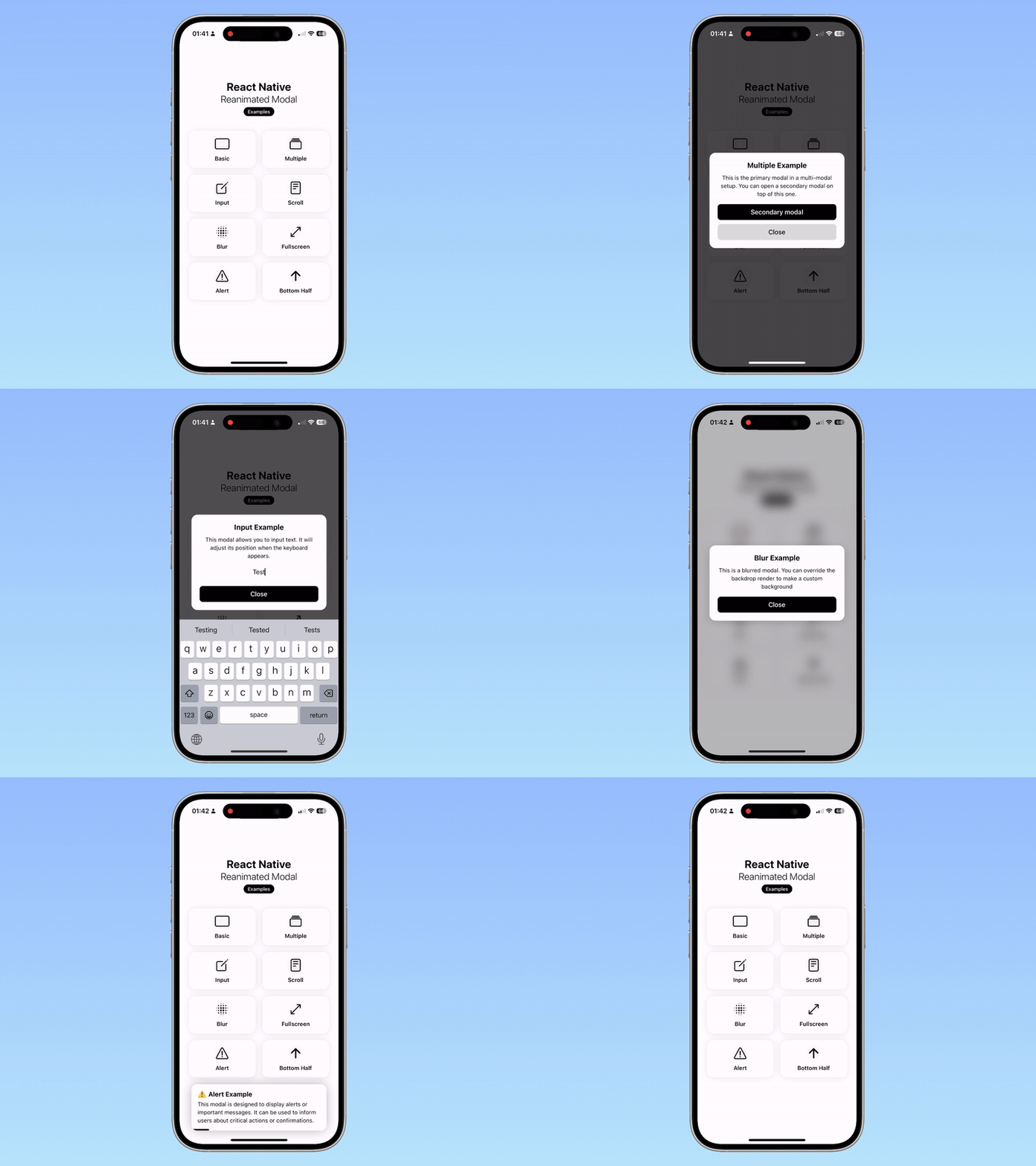
Fig. 01The example app
A modal built on React Native’s own [`Modal`](https://reactnative.dev/docs/modal) — so it behaves like one on every platform — with its animations and gestures in [Reanimated](https://docs.swmansion.com/react-native-reanimated/) and [Gesture Handler](https://docs.swmansion.com/react-native-gesture-handler/): they run on the UI thread, and stay smooth while JavaScript is busy.
```bash
npm install react-native-reanimated-modal
```
## Features
* **[Animations](/react-native-reanimated-modal/animations/)**
`fade`, `slide` from any edge and `scale`, each with its duration — as a string, or a typed config.
* **[Your own animations](/react-native-reanimated-modal/custom-animations/)**
Worklets for the content and the backdrop get the progress, the swipe offset and the state, and return a style: on top of a preset, or as `custom` on their own.
* **[Swipe to dismiss](/react-native-reanimated-modal/swipe/)**
In one direction or all four, with a distance to reach, and a spring back when it is not reached; the backdrop fades as the content goes.
* **[Backdrop](/react-native-reanimated-modal/backdrop/)**
A color and an opacity, your own component (a blur), or none; a press closes the modal, or calls your handler, or does nothing.
* **[Declarative or imperative](/react-native-reanimated-modal/ref/)**
`visible` and `onHide` like any modal, or `ref.current.open()` / `close()` when the modal is mounted visible.
* **[Several at once](/react-native-reanimated-modal/multiple-modals/)**
`coverScreen` draws the modal in your tree instead of a native window: modals stack, and sit in a `FullWindowOverlay` above React Navigation’s screens.
* **[Native behaviour](/react-native-reanimated-modal/platforms/)**
The Android back button (or your handler for it), translucent status and navigation bars, iOS orientations — the native `Modal`’s props, passed through.
* **[Testable](/react-native-reanimated-modal/testing/)**
Test IDs for the container, the backdrop and the content; works with Jest and React Native Testing Library.
* **Small**
One component in TypeScript, no dependencies of its own: Reanimated, Worklets and Gesture Handler are peers.
## For AI assistants
Every page is also Markdown: add `.md` to its URL, or use **Copy page** above its title. [`llms.txt`](/react-native-reanimated-modal/llms.txt) lists them, [`llms-full.txt`](/react-native-reanimated-modal/llms-full.txt) is all of them in one file — [LLMs](/react-native-reanimated-modal/llms/).
# Getting started
> Install react-native-reanimated-modal and its peers, check the version for your Expo SDK or Worklets, and show a first modal.
## Install
```bash
npm install react-native-reanimated-modal
# or: yarn add react-native-reanimated-modal · pnpm add react-native-reanimated-modal · bun add react-native-reanimated-modal
```
The library has no dependencies of its own. It needs these peers, each installed by its own guide — they have native code and a Babel plugin to set up:
| Package | Why |
| ------------------------------------------------------------------------------------------------------------------------ | --------------------------------------- |
| [`react-native-reanimated`](https://docs.swmansion.com/react-native-reanimated/docs/fundamentals/getting-started/) | The animations, on the UI thread |
| [`react-native-worklets`](https://docs.swmansion.com/react-native-worklets/docs/) | Reanimated 4’s worklets, and its plugin |
| [`react-native-gesture-handler`](https://docs.swmansion.com/react-native-gesture-handler/docs/fundamentals/installation) | Swipe to dismiss |
With Expo, `npx expo install react-native-reanimated react-native-worklets react-native-gesture-handler` picks the versions of your SDK, and `babel-preset-expo` adds the Worklets plugin by itself. Without Expo, add `react-native-worklets/plugin` to your `babel.config.js`.
## Version compatibility
Version **1.2.5** moved to the Worklets API of `react-native-worklets` 0.7.2 and later; it does not run with older Worklets.
| `react-native-reanimated-modal` | `react-native-worklets` | Expo SDK |
| ------------------------------- | ----------------------- | -------- |
| 1.2.5 and later | 0.7.2 and later | 55+ |
| 1.2.4 | 0.5.1 | 54 |
On Expo SDK 54 or below, or with `react-native-worklets@0.5.1`, install 1.2.4:
```bash
npm install react-native-reanimated-modal@1.2.4
```
Mismatched versions fail at runtime or leave the modal without its animations. The current release is developed and tested against the [example app](/react-native-reanimated-modal/example/)’s versions: Expo SDK 58, React Native 0.88, Reanimated 4.7, Worklets 0.13 and Gesture Handler 3.3.
## A first modal
Wrap your app in `GestureHandlerRootView` once — the modal’s swipe needs it on iOS (on Android the modal brings its own):
```tsx
import { useState } from 'react';
import { Button, Text, View } from 'react-native';
import { GestureHandlerRootView } from 'react-native-gesture-handler';
import { Modal } from 'react-native-reanimated-modal';
export default function App() {
const [visible, setVisible] = useState(false);
return (
setVisible(false)}>
Hello from the modal!
);
}
```
By default it fades in over a black backdrop at 70% opacity, and closes on a press of the backdrop, a swipe down or the Android back button.
`visible` is yours: the modal animates whenever it changes. When the user closes the modal — backdrop, swipe, back button — it animates out and calls `onHide`, where you set `visible` to `false`. **Always pass `onHide`**: swipe to dismiss is off without it, and a modal closed by the user while `visible` stays `true` opens again.
The content is laid out in a full-screen container, centered vertically by default. Style that container with `style` and the animated wrapper around your content with `contentContainerStyle` — `{ flex: 1 }` for a [full-screen modal](/react-native-reanimated-modal/animations/#a-full-screen-sheet), `justifyContent: 'flex-end'` on `style` for a [bottom sheet](/react-native-reanimated-modal/animations/#a-bottom-sheet).
## Next
* [Animations](/react-native-reanimated-modal/animations/) — fade, slide and scale, and their options.
* [Swipe to dismiss](/react-native-reanimated-modal/swipe/) — directions, distance, bounce.
* [Backdrop](/react-native-reanimated-modal/backdrop/) — color, blur, press handling.
* [`Modal` props](/react-native-reanimated-modal/api/modal/) — all of them in one table.
# Animations
> The fade, slide and scale presets — as a string or a typed config with its duration, slide direction and scale factor — and layouts built on them, a bottom sheet and a full-screen modal.
The `animation` prop picks how the modal comes in and goes out. A string takes a preset with its defaults; an object sets its options:
```tsx
…
…
```
Without `animation`, the modal fades in 300 ms. Opening eases out, closing eases in, both over the same `duration`; the backdrop fades with the content whatever the preset.
## Presets
| `type` | Content | Options |
| -------- | ------------------------------------------------------------------------------------- | ------------------------------------------------------ |
| `fade` | Opacity 0 → 1 | `duration` (`300`) |
| `slide` | Moves in from beyond an edge of the screen, fully opaque | `duration` (`300`), `direction` (`'down'`) |
| `scale` | Grows from `scaleFactor` to its size while fading in | `duration` (`300`), `scaleFactor` (`0.8`, from 0 to 1) |
| `custom` | Opacity only — the rest is [yours](/react-native-reanimated-modal/custom-animations/) | `duration` (`300`), `contentAnimatedStyle` |
Every preset also takes `contentAnimatedStyle` and `backdropAnimatedStyle`, worklets that add to its styles: [Custom animations](/react-native-reanimated-modal/custom-animations/).
## Slide direction
`direction` is the edge the content comes from — `'down'` is the bottom of the screen — and the one it leaves through when closed:
```tsx
…
```
It also takes `{ start, end }`: `start` is the edge it comes from, `end` one or more directions meant for swipe to dismiss:
```tsx
animation={{
type: 'slide',
duration: 500,
direction: { start: 'down', end: ['down', 'right'] },
}}
```
> **Caution**
>
> The swipe directions are set by the `swipe` prop, and it has `['down']` by default: `direction` (and its `end`) only decide them when you pass `swipe={{ directions: [] }}`. To dismiss a modal sliding from the top with a swipe up, set `swipe={{ directions: ['up'] }}` — see [Swipe to dismiss](/react-native-reanimated-modal/swipe/#directions).
## Typed configs
Each preset’s config has its own type; `ModalAnimationConfig<'slide'>` and the others check the options of that preset:
```tsx
import type { ModalAnimationConfig } from 'react-native-reanimated-modal';
const sheet: ModalAnimationConfig<'slide'> = {
type: 'slide',
duration: 500,
direction: 'down',
};
const pop: ModalAnimationConfig<'scale'> = {
type: 'scale',
duration: 250,
scaleFactor: 0.6,
};
```
Define configs outside the component, or memoize them: the modal recomputes its setup when `animation` changes identity.
## A bottom sheet
`style` is the full-screen container the content is laid out in — move the content to its bottom, and slide it from there:
```tsx
…
```
Add the bottom safe area inset to its padding (`useSafeAreaInsets` from `react-native-safe-area-context`).
## A full-screen sheet
`contentContainerStyle` styles the animated wrapper of your content: `flex: 1` makes it fill the screen. A full-screen modal usually needs no backdrop:
```tsx
…
```
# Custom animations
> Worklets for the content and the backdrop — what they receive (state, progress, swipe offsets, screen size), how their style merges with a preset's, and the custom type that has none.
Every animation config takes two optional worklets, `contentAnimatedStyle` and `backdropAnimatedStyle`. They run on the UI thread on every frame of the animation and of a swipe, and return a style that is merged into the preset’s:
```tsx
{
'worklet';
// a wobble on top of the fade
return {
transform: [{ scale: 1 + Math.sin(progress * Math.PI * 2) * 0.1 }],
};
},
}}
>
…
```
Start each function with the `'worklet'` directive. It runs on the UI thread: use only its arguments, shared values and other worklets — no React state, no JavaScript functions without `scheduleOnRN`.
## What they receive
| Argument | Type | Meaning |
| ---------------- | ----------------------------- | -------------------------------------------------------------------------------------------------------- |
| `animationState` | `ModalAnimationState \| null` | `'opening'`, `'closing'`, `'sliding'` (a swipe), `'bouncing'` (back after a short swipe), `null` at rest |
| `progress` | `number` | `0` closed → `1` open; moves while opening and closing |
| `offsetX` | `number` | The content’s horizontal offset in pixels while swiped (and while it leaves after a swipe) |
| `offsetY` | `number` | The same, vertical |
| `swipeDirection` | `SwipeDirection \| null` | The direction of the current swipe, once it is known |
| `screenWidth` | `number` | The window’s width |
| `screenHeight` | `number` | The window’s height |
A swipe that dismisses the modal switches the state to `'closing'` but leaves `progress` at `1`: the content leaves along `offsetX` / `offsetY`, then the modal hides.
## How the styles merge
Your style is spread over the preset’s, so a key you return replaces the preset’s value — `opacity`, for instance. `transform` is the exception: your transforms are **appended** to the preset’s (a slide’s `translateX`/`translateY`, a scale’s `scale`), so a `rotate` adds to the slide instead of cancelling it.
For the backdrop, the preset’s style is its `opacity`; return `backgroundColor` to tint it as it fades:
```tsx
animation={{
type: 'slide',
direction: 'down',
contentAnimatedStyle: ({ progress }) => {
'worklet';
return { transform: [{ rotate: `${(1 - progress) * 15}deg` }] };
},
backdropAnimatedStyle: ({ progress }) => {
'worklet';
return { backgroundColor: `rgba(20, 0, 60, ${progress * 0.6})` };
},
}}
```
## The `custom` type
`type: 'custom'` has no preset motion — the content only fades with `progress` — and is meant for a `contentAnimatedStyle` that does the rest, the swipe included:
```tsx
animation={{
type: 'custom',
duration: 800,
contentAnimatedStyle: ({ animationState, progress, offsetX, offsetY }) => {
'worklet';
if (animationState === 'sliding' || animationState === 'bouncing') {
const pulled = Math.min(1, Math.hypot(offsetX, offsetY) / 300);
return { opacity: 1 - pulled * 0.5, transform: [{ scale: 1 - pulled * 0.2 }] };
}
return {
opacity: progress,
transform: [{ perspective: 800 }, { rotateY: `${(1 - progress) * 90}deg` }],
};
},
}}
```
While swiped, every preset — `custom` included — already moves the content by `offsetX` / `offsetY`; your transforms come after those.
## Reusing the defaults
The defaults are exported, for configs built on them:
```tsx
import {
DEFAULT_MODAL_ANIMATION_DURATION,
DEFAULT_MODAL_SCALE_FACTOR,
type ModalAnimationConfig,
} from 'react-native-reanimated-modal';
const slowPop: ModalAnimationConfig<'scale'> = {
type: 'scale',
duration: DEFAULT_MODAL_ANIMATION_DURATION * 2,
scaleFactor: DEFAULT_MODAL_SCALE_FACTOR,
};
```
All of them: [Constants and helpers](/react-native-reanimated-modal/api/constants/).
# Swipe to dismiss
> The swipe prop — directions, the distance that dismisses, the spring back after a short swipe — what it needs to be on, and scrolling content inside a swipeable modal.
A modal closes when its content is dragged far enough in an allowed direction: it then leaves the screen that way, the backdrop fading with it. A shorter drag springs it back. By default the direction is `down` and the distance 100 pixels:
```tsx
…
```
`swipe={false}` turns it off. The swipe is also off when the modal is not `closable` or has no `onHide`.
## Options
| Option | Default | Description |
| ------------------------ | -------------------------------------- | ------------------------------------------------------------------------------------------------------------------------------------------------ |
| `enabled` | `true` | Whether a swipe can dismiss the modal |
| `directions` | `['down']` | The directions that dismiss: any of `'up'`, `'down'`, `'left'`, `'right'` |
| `threshold` | `100` | Pixels to drag for the modal to close when released |
| `bounceSpringConfig` | `{ dampingRatio: 0.5, duration: 700 }` | Reanimated’s [spring config](https://docs.swmansion.com/react-native-reanimated/docs/animations/withSpring/) of the way back after a short swipe |
| `bounceOpacityThreshold` | `0.05` | While springing back, the backdrop snaps to its full opacity once it is this close to it |
The options you pass are merged over the defaults: `{ threshold: 150 }` keeps `directions: ['down']`.
## Directions
A swipe takes the direction it first moves in — horizontal or vertical, whichever is larger — and follows only that axis. A direction not in `directions` does not move the content.
`directions` always wins over the [slide direction](/react-native-reanimated-modal/animations/#slide-direction). The slide’s `direction` (or its `end`) decides the swipe only when `directions` is empty:
```tsx
// slides in from the top; swiped up, it leaves the way it came
…
// the same, spelled out
…
```
## While dragging
The content follows the finger at full opacity; the backdrop fades by how far the content has moved compared to the screen’s width or height. The [animation worklets](/react-native-reanimated-modal/custom-animations/) get `animationState: 'sliding'`, `offsetX` / `offsetY` and `swipeDirection`, then `'bouncing'` or `'closing'` when it is released.
## Scrolling inside the modal
The swipe is a Gesture Handler pan on the content. Use Gesture Handler’s `ScrollView` (or `FlatList`) inside it, and keep the swipe to the axis the list does not scroll along, or only to `down`:
```tsx
import { ScrollView } from 'react-native-gesture-handler';
function ListModal({ visible, hide }: Props) {
return (
…
);
}
```
The example app’s *Scroll* modal does this.
# Backdrop
> The backdrop prop — a color and an opacity, your own component such as a blur, or none — and onBackdropPress, to close, run your own handler or ignore presses.
Behind the content, a backdrop covers the screen and fades in with it: black at 70% opacity by default. Pressing it closes the modal.
## Color and opacity
```tsx
…
```
| Option | Default | Description |
| --------- | --------- | ----------------------------------------------- |
| `enabled` | `true` | Whether there is a backdrop |
| `color` | `'black'` | Any React Native color |
| `opacity` | `0.7` | Its opacity when the modal is open, from 0 to 1 |
The options are merged over the defaults. A semi-transparent `color` multiplies with `opacity`.
## Your own backdrop
Pass an element instead, and it is drawn in the backdrop’s place — it fades in and out, and fades during a swipe, like the default one. Make it fill its parent:
```tsx
import { BlurView } from 'expo-blur';
import { StyleSheet } from 'react-native';
function BlurredModal({ visible, hide }: Props) {
return (
}
>
…
);
}
```
Any element works: a gradient, an image, a view with its own animation.
## No backdrop
`backdrop={false}` (or `{ enabled: false }`) draws none: the screen behind stays visible and nothing closes the modal on a press around it. On top of a native `Modal`, the app behind still does not get touches; with [`coverScreen`](/react-native-reanimated-modal/multiple-modals/) it does — a toast or an alert that leaves the screen usable:
```tsx
…
```
## Pressing the backdrop
`onBackdropPress` decides what a press does:
| `onBackdropPress` | A press on the backdrop |
| ----------------- | ------------------------------------------------------------------------ |
| not set | Closes the modal: the animation, then `onHide` |
| a function | Calls it **instead** of closing — close the modal from it if you want to |
| `false` | Does nothing; the swipe and the back button still close the modal |
```tsx
// ask first
confirmDiscard().then((ok) => ok && hide())}
>
…
```
With `closable={false}` a press never closes the modal and `onBackdropPress` is not called.
# Ref API
> open() and close() through a ref — for a modal mounted visible that closes itself with its animation — and why close() still needs an onHide that sets visible to false.
The modal takes a `ref` with two methods, `open()` and `close()`. They run the same animations as a change of `visible`, and do nothing while the modal is already open (or closed) or still animating.
They are for a modal that owns its lifetime — mounted with `visible` from the start, for instance by a navigator or a modal manager, and closing itself with its animation before it is unmounted:
```tsx
import { useRef } from 'react';
import { Button } from 'react-native';
import { Modal, type ModalRef } from 'react-native-reanimated-modal';
function ConfirmModal({ onDismiss }: { onDismiss: () => void }) {
const modal = useRef(null);
return (
);
}
```
| Method | Does |
| --------- | -------------------------------------------------------------------------------------- |
| `open()` | Shows the modal with its animation; nothing if it is open or animating |
| `close()` | Hides it with its animation, then calls `onHide`; nothing if it is closed or animating |
> **Caution**
>
> `visible` stays the source of truth. After `close()`, `onHide` must set `visible` to `false` — or unmount the modal, as `onDismiss` above does. If `visible` is still `true` once the animation ends, the modal opens again.
>
> The same holds the other way: `open()` on a modal whose `visible` is `false` shows it, and the modal closes again as soon as it is open.
For a modal you show and hide from its parent, `visible` is all you need — the methods add nothing there.
# Multiple modals
> coverScreen draws the modal in your view tree instead of a native window — for modals stacked on each other, touches through to the app, and modals over React Navigation's native stack in a FullWindowOverlay.
By default the modal is a React Native [`Modal`](https://reactnative.dev/docs/modal): a native window above the app, transparent, with the animations drawn inside it. That is what makes it cover tab bars, headers and native screens without any setup.
With `coverScreen`, it is drawn **in your tree** instead — an absolutely positioned view over its parent, the full size of the screen when the parent is:
```tsx
…
```
| | Native `Modal` (default) | `coverScreen` |
| -------------------------------------------------------------------------- | ------------------------------------------------------ | ---------------------------------------------------------- |
| Covers | Everything, native screens and the status bar included | Its parent: put it at the root of the screen or of the app |
| Several open at once | One native modal at a time is reliable | As many as you like, later ones on top |
| Touches outside the content | Never reach the app | Pass through where there is no backdrop |
| `statusBarTranslucent`, `supportedOrientations` and the other native props | Applied | Ignored |
| Android back button | Through the native `onRequestClose` | Through `BackHandler` |
## Stacking modals
Render the modals side by side with `coverScreen`, at a level that covers the screen; the one rendered last is on top:
```tsx
<>
setFirst(false)}
coverScreen
animation={{ type: 'slide', direction: 'up' }}
swipe={{ directions: ['up', 'down', 'left', 'right'] }}
>
setSecond(false)}
coverScreen
animation={{ type: 'slide', direction: 'left' }}
swipe={{ directions: ['left', 'down', 'right', 'up'] }}
>
…
```
## With React Navigation
Screens of `@react-navigation/native-stack` are native views: a `coverScreen` modal inside a screen stays under the stack’s header and under modal screens presented over it. On iOS, `FullWindowOverlay` from `react-native-screens` lifts its children into a window above all of them:
```tsx
import type { ReactNode } from 'react';
import { Platform } from 'react-native';
import { FullWindowOverlay } from 'react-native-screens';
import { Modal } from 'react-native-reanimated-modal';
const Overlay = ({ children }: { children: ReactNode }) =>
Platform.OS === 'ios' ? (
{children}
) : (
<>{children}
);
function Modals() {
return (
setFirst(false)} coverScreen>
…
setSecond(false)} coverScreen>
…
);
}
```
Always set `coverScreen` inside a `FullWindowOverlay`: a native `Modal` there would open a window of its own and lose the layering.
# Platforms
> The Android back button and onBackButtonPress, closable, the native Modal props passed through (status and navigation bars, hardware acceleration, iOS orientations), and the web.
## Android back button
While the modal is open, the hardware back button closes it, like a backdrop press. `onBackButtonPress` replaces that — ask before discarding a form, go back a step inside the modal, or ignore the press:
```tsx
{
if (step > 0) setStep(step - 1);
else hide();
}}
>
…
```
The handler is called on Android only, whether or not the modal is `closable`; to keep a modal open on a back press, pass one that does nothing. On iOS there is no back button, and on the web the modal does not listen for one.
## Closable
`closable={false}` turns off what the user can close the modal with — the backdrop press and the swipe — for a modal that closes only when you set `visible` to `false`: a required choice, a blocking progress screen. On Android, give it an `onBackButtonPress` as well, so that the back button cannot close it either:
```tsx
{}}>
```
## Native `Modal` props
These are passed to React Native’s [`Modal`](https://reactnative.dev/docs/modal) (and ignored with [`coverScreen`](/react-native-reanimated-modal/multiple-modals/), which does not use one):
| Prop | Platform | Description |
| -------------------------- | -------- | ----------------------------------------------------------------------- |
| `statusBarTranslucent` | Android | Draws the modal under the status bar — a backdrop over the whole screen |
| `navigationBarTranslucent` | Android | Draws it under the navigation bar too (with `statusBarTranslucent`) |
| `hardwareAccelerated` | Android | Forces hardware acceleration for the modal’s window |
| `supportedOrientations` | iOS | The orientations the modal can rotate to |
| `onOrientationChange` | iOS | Called when the orientation changes while the modal is shown |
The modal measures the window (`useWindowDimensions`), so slide distances and swipe fades follow rotations and split screens.
On Android, set `statusBarTranslucent` for a backdrop that covers the status bar, and change the status bar’s style from inside the modal (`expo-status-bar`’s `` among its children) if the backdrop needs it.
## Web
The modal runs on [React Native Web](https://necolas.github.io/react-native-web/) — the example app is built for it in CI. There, React Native Web’s `Modal` is a layer in the page, and the back button is not handled.
# Testing
> The modal's test IDs, and a Jest setup for React Native Testing Library — Reanimated's test mode, Worklets' mock and Gesture Handler's root view.
## Test IDs
Three elements carry a `testID`, each with a default and a prop to change it — for several modals on one screen, or your end-to-end tests:
| Prop | Default | Element |
| ----------------- | ------------------- | -------------------------------------------------------------- |
| `containerTestID` | `'modal-container'` | The full-screen container (`style`) |
| `backdropTestID` | `'modal-backdrop'` | The backdrop’s `Pressable` — absent with `backdrop={false}` |
| `contentTestID` | `'modal-content'` | The animated wrapper of your content (`contentContainerStyle`) |
Nothing is rendered while the modal is closed: `queryByTestId('modal-content')` is `null`.
## Jest
The library’s own tests run on `@react-native/jest-preset` with React Native Testing Library. Reanimated, Worklets and Gesture Handler need their test setups — in a file listed in `setupFilesAfterEnv`:
**jest-setup.js**
```js
require('react-native-gesture-handler/jestSetup');
jest.mock('react-native-worklets', () => {
const mock = require('react-native-worklets/src/mock');
// run callbacks scheduled from worklets right away
return { ...mock, scheduleOnRN: (fn, ...args) => fn(...args) };
});
require('react-native-reanimated').setUpTests();
```
**package.json**
```json
{
"jest": {
"preset": "@react-native/jest-preset",
"resolver": "react-native-reanimated/jest/resolver",
"setupFilesAfterEnv": ["/jest-setup.js"]
}
}
```
Render under a `GestureHandlerRootView`, as the app does — Gesture Handler 3 throws when a gesture has no root view above it:
```tsx
import { fireEvent, render, screen } from '@testing-library/react-native';
import { Text } from 'react-native';
import { GestureHandlerRootView } from 'react-native-gesture-handler';
import { Modal } from 'react-native-reanimated-modal';
it('closes on a backdrop press', async () => {
const onHide = jest.fn();
await render(
Hello,
{ wrapper: GestureHandlerRootView }
);
expect(screen.getByText('Hello')).toBeTruthy();
fireEvent.press(screen.getByTestId('modal-backdrop'));
// …advance timers or wait for onHide: the modal closes after its animation
});
```
The animations run in Reanimated’s test mode; use Jest’s fake timers (`jest.useFakeTimers()`, `jest.advanceTimersByTime(300)`) to move them along. Swipes are Gesture Handler gestures: drive them with its [testing API](https://docs.swmansion.com/react-native-gesture-handler/docs/guides/testing), or test `onHide` through the backdrop and `visible`.
# Modal
> Every prop of the Modal component — visibility, layout, animation, swipe, backdrop, events, native Modal props and test IDs — with types and defaults, and its ref.
```tsx
import {
Modal,
type ModalProps,
type ModalRef,
} from 'react-native-reanimated-modal';
```
`Modal` is a function component with `forwardRef`; its props are `ModalProps`, its ref is [`ModalRef`](#ref).
## Visibility and layout
| Prop | Type | Default | Description |
| ----------------------- | ---------------------- | ------- | ---------------------------------------------------------------------------------------------------------------------------- |
| `visible` | `boolean` | — | Whether the modal is shown. A change animates it in or out |
| `children` | `ReactNode` | — | The content |
| `closable` | `boolean` | `true` | Whether a backdrop press or a swipe can close it. [Platforms](/react-native-reanimated-modal/platforms/#closable) |
| `style` | `StyleProp` | — | The full-screen container the content is laid out in (`flex: 1`, `justifyContent: 'center'`) |
| `contentContainerStyle` | `StyleProp` | — | The animated wrapper of the content |
| `coverScreen` | `boolean` | `false` | Draws the modal in your tree instead of a native `Modal`. [Multiple modals](/react-native-reanimated-modal/multiple-modals/) |
## Animation, swipe, backdrop
| Prop | Type | Default | Description |
| ----------------- | --------------------------------------------- | --------------------------------------------------------- | ------------------------------------------------------------------------------------------------------------------------------------------- |
| `animation` | `ModalAnimationConfigUnion \| ModalAnimation` | `{ type: 'fade', duration: 300 }` | A preset name or a config. [Animations](/react-native-reanimated-modal/animations/) |
| `swipe` | `ModalSwipeConfig \| false` | `{ enabled: true, directions: ['down'], threshold: 100 }` | Swipe to dismiss; `false` turns it off. [Swipe to dismiss](/react-native-reanimated-modal/swipe/) |
| `backdrop` | `ModalBackdropConfig \| ReactNode \| false` | `{ enabled: true, color: 'black', opacity: 0.7 }` | A config, your element, or `false` for none. [Backdrop](/react-native-reanimated-modal/backdrop/) |
| `onBackdropPress` | `(() => void) \| false` | — | Replaces the close on a backdrop press; `false` ignores presses. [Backdrop](/react-native-reanimated-modal/backdrop/#pressing-the-backdrop) |
## Events
| Prop | Type | Description |
| ------------------- | ------------ | -------------------------------------------------------------------------------------------------------------------------------------------------------- |
| `onShow` | `() => void` | Called when the opening animation has finished |
| `onHide` | `() => void` | Called when the closing animation has finished — set `visible` to `false` here. Without it the swipe is off |
| `onBackButtonPress` | `() => void` | Android: replaces the close on a hardware back press while the modal is open. [Platforms](/react-native-reanimated-modal/platforms/#android-back-button) |
## Native `Modal` props
Passed through to React Native’s `Modal`; ignored with `coverScreen`. [Platforms](/react-native-reanimated-modal/platforms/#native-modal-props)
| Prop | Platform |
| -------------------------- | -------- |
| `statusBarTranslucent` | Android |
| `navigationBarTranslucent` | Android |
| `hardwareAccelerated` | Android |
| `supportedOrientations` | iOS |
| `onOrientationChange` | iOS |
## Test IDs
| Prop | Type | Default |
| ----------------- | -------- | ------------------- |
| `containerTestID` | `string` | `'modal-container'` |
| `backdropTestID` | `string` | `'modal-backdrop'` |
| `contentTestID` | `string` | `'modal-content'` |
[Testing](/react-native-reanimated-modal/testing/)
## Ref
```ts
interface ModalRef {
open: () => void;
close: () => void;
}
```
| Method | Description |
| --------- | -------------------------------------------------------------------------------------------- |
| `open()` | Opens the modal with its animation. Does nothing if it is open or animating |
| `close()` | Closes it with its animation, then calls `onHide`. Does nothing if it is closed or animating |
[Ref API](/react-native-reanimated-modal/ref/)
# Types
> The exported TypeScript types — animation presets and their configs, the worklet signature and animation states, swipe and backdrop configs, ModalRef.
Everything below is exported from `react-native-reanimated-modal` as a type. The type declarations in your `node_modules` document the version you installed: `lib/typescript/src/types.d.ts`.
## Names
```ts
type ModalAnimation = 'fade' | 'slide' | 'scale' | 'custom';
type SwipeDirection = 'up' | 'down' | 'left' | 'right';
type ModalAnimationState = 'opening' | 'sliding' | 'bouncing' | 'closing';
```
| `ModalAnimationState` | When |
| --------------------- | ------------------------------------------------------------------------------ |
| `'opening'` | The opening animation: `progress` 0 → 1 |
| `'closing'` | The closing animation (`progress` 1 → 0), or the content leaving after a swipe |
| `'sliding'` | The user is dragging the content |
| `'bouncing'` | The content springs back after a swipe too short to close |
## Animation configs
```ts
// shared by every preset (not exported itself)
interface BaseAnimationConfig {
duration?: number; // ms, default 300
contentAnimatedStyle?: ModalAnimatedStyleFunction;
backdropAnimatedStyle?: ModalAnimatedStyleFunction;
}
interface FadeAnimationConfig extends BaseAnimationConfig {
type: 'fade';
}
interface SlideAnimationConfig extends BaseAnimationConfig {
type: 'slide';
direction?: // default 'down'
| SwipeDirection
| { start: SwipeDirection; end: SwipeDirection | SwipeDirection[] };
}
interface ScaleAnimationConfig extends BaseAnimationConfig {
type: 'scale';
scaleFactor?: number; // 0–1, default 0.8
}
interface CustomAnimationConfig extends BaseAnimationConfig {
type: 'custom';
}
type ModalAnimationConfigUnion =
| FadeAnimationConfig
| SlideAnimationConfig
| ScaleAnimationConfig
| CustomAnimationConfig;
// the config of one preset: ModalAnimationConfig<'slide'> is SlideAnimationConfig
type ModalAnimationConfig = /* … */;
```
[Animations](/react-native-reanimated-modal/animations/)
## `ModalAnimatedStyleFunction`
The signature of `contentAnimatedStyle` and `backdropAnimatedStyle` — a worklet:
```ts
type ModalAnimatedStyleFunction = (props: {
animationState: ModalAnimationState | null;
swipeDirection?: SwipeDirection | null; // while swiped
progress: number; // 0 closed → 1 open
offsetX: number; // px, while swiped
offsetY: number; // px, while swiped
screenWidth: number;
screenHeight: number;
}) => ViewStyle;
```
[Custom animations](/react-native-reanimated-modal/custom-animations/)
## `ModalSwipeConfig`
```ts
interface ModalSwipeConfig {
enabled?: boolean; // default true
directions?: SwipeDirection[]; // default ['down']
threshold?: number; // px, default 100
bounceSpringConfig?: SpringConfig; // Reanimated's, default { dampingRatio: 0.5, duration: 700 }
bounceOpacityThreshold?: number; // default 0.05
}
```
[Swipe to dismiss](/react-native-reanimated-modal/swipe/)
## `ModalBackdropConfig`
```ts
interface ModalBackdropConfig {
enabled?: boolean; // default true
color?: string; // default 'black'
opacity?: number; // 0–1, default 0.7
}
```
[Backdrop](/react-native-reanimated-modal/backdrop/)
## `ModalRef` and `ModalProps`
`ModalRef` is the ref’s handle, `{ open(): void; close(): void }`; `ModalProps` the component’s props. Both are in the [`Modal` reference](/react-native-reanimated-modal/api/modal/).
# Constants and helpers
> The exported defaults — durations, scale factor, swipe threshold and direction, bounce spring, backdrop — and the functions that fill a partial config with them.
## Defaults
| Constant | Value |
| ---------------------------------------- | ----------------------------------------------------------------------------------------------------------------------------- |
| `DEFAULT_MODAL_ANIMATION_DURATION` | `300` |
| `DEFAULT_MODAL_SCALE_FACTOR` | `0.8` |
| `DEFAULT_MODAL_SWIPE_THRESHOLD` | `100` |
| `DEFAULT_MODAL_SWIPE_DIRECTION` | `'down'` |
| `DEFAULT_MODAL_BOUNCE_SPRING_CONFIG` | `{ dampingRatio: 0.5, duration: 700 }` |
| `DEFAULT_MODAL_BOUNCE_OPACITY_THRESHOLD` | `0.05` |
| `DEFAULT_MODAL_BACKDROP_CONFIG` | `{ enabled: true, color: 'black', opacity: 0.7 }` |
| `DEFAULT_MODAL_SWIPE_CONFIG` | `{ enabled: true, directions: ['down'], threshold: 100, bounceSpringConfig, bounceOpacityThreshold }` — the defaults above |
| `DEFAULT_MODAL_ANIMATION_CONFIGS` | `{ fade, slide, scale }`: each preset with `duration: 300`, `slide` with `direction: 'down'`, `scale` with `scaleFactor: 0.8` |
Build on them rather than repeating the numbers:
```tsx
import {
DEFAULT_MODAL_BACKDROP_CONFIG,
DEFAULT_MODAL_SWIPE_THRESHOLD,
} from 'react-native-reanimated-modal';
const backdrop = { ...DEFAULT_MODAL_BACKDROP_CONFIG, opacity: 0.9 };
const swipe = { threshold: DEFAULT_MODAL_SWIPE_THRESHOLD * 1.5 };
//
```
## Helpers
The functions the modal fills its props with, for wrappers of your own that need the same resolved values:
| Function | Returns |
| ---------------------------------------------------------- | ----------------------------------------------------------------------------------------------------------------------- |
| `normalizeAnimationConfig(animation?)` | A complete `ModalAnimationConfigUnion`: a preset name becomes its default config; a missing `type` is `'fade'` |
| `normalizeSwipeConfig(swipe?)` | A complete `ModalSwipeConfig` — the defaults with yours over them; `false` gives `{ enabled: false }` |
| `normalizeBackdropConfig(backdrop?)` | `{ enabled, isCustom, config, customRenderer? }`: whether there is one, and whether it is your element |
| `getSwipeDirections(swipe, animation?, fallback = 'down')` | The dismissing directions: `swipe.directions` when not empty, else the slide’s `direction` (its `end`), else `fallback` |
| `getSlideInDirection(animation, fallback = 'down')` | The edge a slide comes from: its `direction` (its `start`), else `fallback` |
# Example app
> The Expo example app — open it on your phone with Expo Go from its QR code, or run it from the repository — and the use cases it shows, from a bottom sheet to stacked modals.
The repository’s [`example/`](https://github.com/whidrubeld/react-native-reanimated-modal/tree/master/example) is an Expo app with a modal for every use case below.
## On your phone

1. Install [Expo Go](https://expo.dev/go).
2. Scan the QR code with the camera (iOS) or from Expo Go (Android).
3. The example opens in Expo Go.
## From the repository
```bash
pnpm install
pnpm example start # Metro; then press i, a or w
pnpm example ios # or: android, web
```
The app uses the library’s source (`src/`) through Metro: changes show up without a build. More in [CONTRIBUTING.md](https://github.com/whidrubeld/react-native-reanimated-modal/blob/master/CONTRIBUTING.md).
## Use cases
| Modal | Shows | Source |
| ----------- | --------------------------------------------------------------------------------------- | -------------------------------------------------------------------------------------------------------------------------------- |
| Basic | The defaults: fade, backdrop, swipe down | [`Basic.tsx`](https://github.com/whidrubeld/react-native-reanimated-modal/blob/master/example/src/use-cases/Basic.tsx) |
| Multiple | Two `coverScreen` modals stacked, sliding from different edges, swiped in any direction | [`Multiple.tsx`](https://github.com/whidrubeld/react-native-reanimated-modal/blob/master/example/src/use-cases/Multiple.tsx) |
| Input | A text field over the keyboard (`react-native-keyboard-controller`) | [`Input.tsx`](https://github.com/whidrubeld/react-native-reanimated-modal/blob/master/example/src/use-cases/Input.tsx) |
| Scroll | A scrolling list in a `scale` modal swiped down | [`Scroll.tsx`](https://github.com/whidrubeld/react-native-reanimated-modal/blob/master/example/src/use-cases/Scroll.tsx) |
| Blur | An `expo-blur` backdrop | [`Blur.tsx`](https://github.com/whidrubeld/react-native-reanimated-modal/blob/master/example/src/use-cases/Blur.tsx) |
| Fullscreen | `contentContainerStyle={{ flex: 1 }}`, sliding | [`Fullscreen.tsx`](https://github.com/whidrubeld/react-native-reanimated-modal/blob/master/example/src/use-cases/Fullscreen.tsx) |
| Alert | A toast without backdrop over a usable screen, dismissed by a swipe or a timer | [`Alert.tsx`](https://github.com/whidrubeld/react-native-reanimated-modal/blob/master/example/src/use-cases/Alert.tsx) |
| Bottom half | A bottom sheet: `justifyContent: 'flex-end'`, a slide, a longer swipe threshold | [`BottomHalf.tsx`](https://github.com/whidrubeld/react-native-reanimated-modal/blob/master/example/src/use-cases/BottomHalf.tsx) |
# LLMs
> The documentation for AI assistants — every page as Markdown, llms.txt and llms-full.txt, Copy page and Open in Claude or ChatGPT, the type declarations of your version.
These pages are written for people and coding agents alike. Every one of them is also plain Markdown, the whole site is one file, and the package’s types document every export of the version you installed.
## Every page as Markdown
Add `.md` to a page’s address: [`/react-native-reanimated-modal/swipe/`](/react-native-reanimated-modal/swipe/) is also [`/react-native-reanimated-modal/swipe.md`](/react-native-reanimated-modal/swipe.md). Each page points to it with ``, so agents that look for it find it.
Above every title, **Copy page** puts that Markdown on the clipboard; its menu also opens it as text, or in a new chat in ChatGPT, Claude and others.
## llms.txt and llms-full.txt
Following [llmstxt.org](https://llmstxt.org):
| File | What | For |
| ---------------------------------------------------------------- | ---------------------------------------------------------------------- | ------------------------------------------------------------------------- |
| [`/llms.txt`](/react-native-reanimated-modal/llms.txt) | The index: the library in a sentence, then every page with its summary | An agent that fetches what it needs — give it this address |
| [`/llms-full.txt`](/react-native-reanimated-modal/llms-full.txt) | Every page in one Markdown file, the guide first | A model with a long context, a tool that indexes docs by URL, offline use |
Prompts that work:
```text
Read https://whidrubeld.github.io/react-native-reanimated-modal/llms.txt, then
turn the filter screen in src/screens/Filters.tsx into a bottom sheet modal.
```
```text
Using https://whidrubeld.github.io/react-native-reanimated-modal/custom-animations.md,
make the modal flip in around its vertical axis.
```
## The API of your version
The pages describe the latest release. The package’s type declarations describe the one you installed — every prop with its documentation comment: `node_modules/react-native-reanimated-modal/lib/typescript/src/types.d.ts`, or [the latest on unpkg](https://unpkg.com/react-native-reanimated-modal/lib/typescript/src/types.d.ts). An agent unsure of a prop’s name or type should read them before guessing.